My personal opinion is probably different to many others but I highly dislike the current main menu. I loved the old one because it captured what in my opinion what the Dalek Mod was. The new Menu or Menus to me seem lazy. Showing what's in the mod is not needed as well as many images that really don't fit with others. I loved the old Howell Titles Esc Menu. It captured how much the mod didn't need to show you because it didn't have to. This is the Dalek Mod we're talking about. A mod that many popular creators on YouTube not affiliated have enjoyed. Hell this is a mod that a lot of the Minecraft fandom have enjoyed.
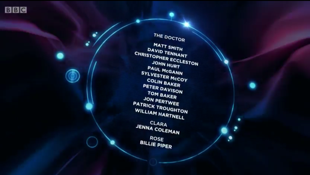
Now I am not saying that you should switch back to the old Menu because it has already been left behind and is apart of its own era of the Dalek Mod, but I believe you guys should consider developing a new menu screen for a future update. My personal opinion is around Update 50 which may seem like a milestone for some people who play this mod and others who have the privilege of working on the mod. What if you guys made something like a 50 Update Anniversary and change the Menu then. Maybe you kind of do what you guys did for Update 40 and make it a title sequence theme. Maybe make it like the Day of the Doctor Closing Title Sequence. Maybe the circles that housed the names in the closing titles would be where the menu stuff would be and you could scroll through different circles.

To be honest I am probably talking nonsense but not just my opinions matter. What are all of your's?
Hmm, you make good points. I'll bring this up next time I talk to the rest of the team.
Hmm, you make good points. I'll bring this up next time I talk to the rest of the team.
Thank you. :D