Ever felt like the War Doctor's interior is a bit empty? Well, I've tried to make an improved version...
So, before we start, if you'd like, you can build it with Schematica from this schematic:
https://drive.google.com/open?id=1nmZvUUqPS2STh_ehf7UP-o0Z18DQVCyD
(Note in order to make the controls invisible like mine you'll need to use the following command while standing on the control: "/blockdata ~ ~ ~ (hide_model:1b)")
On with the showcase!
So, as you all know, the interior is a bit...
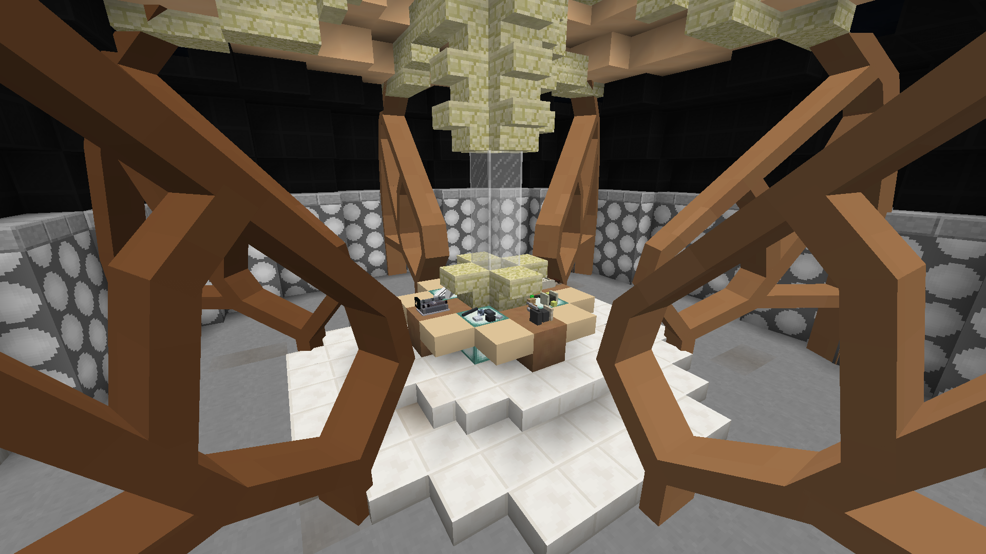
Empty. Specifically, the console. It just feels like there's nothing in it.
Well, I offer you this:
My attempt to make the room feel more full!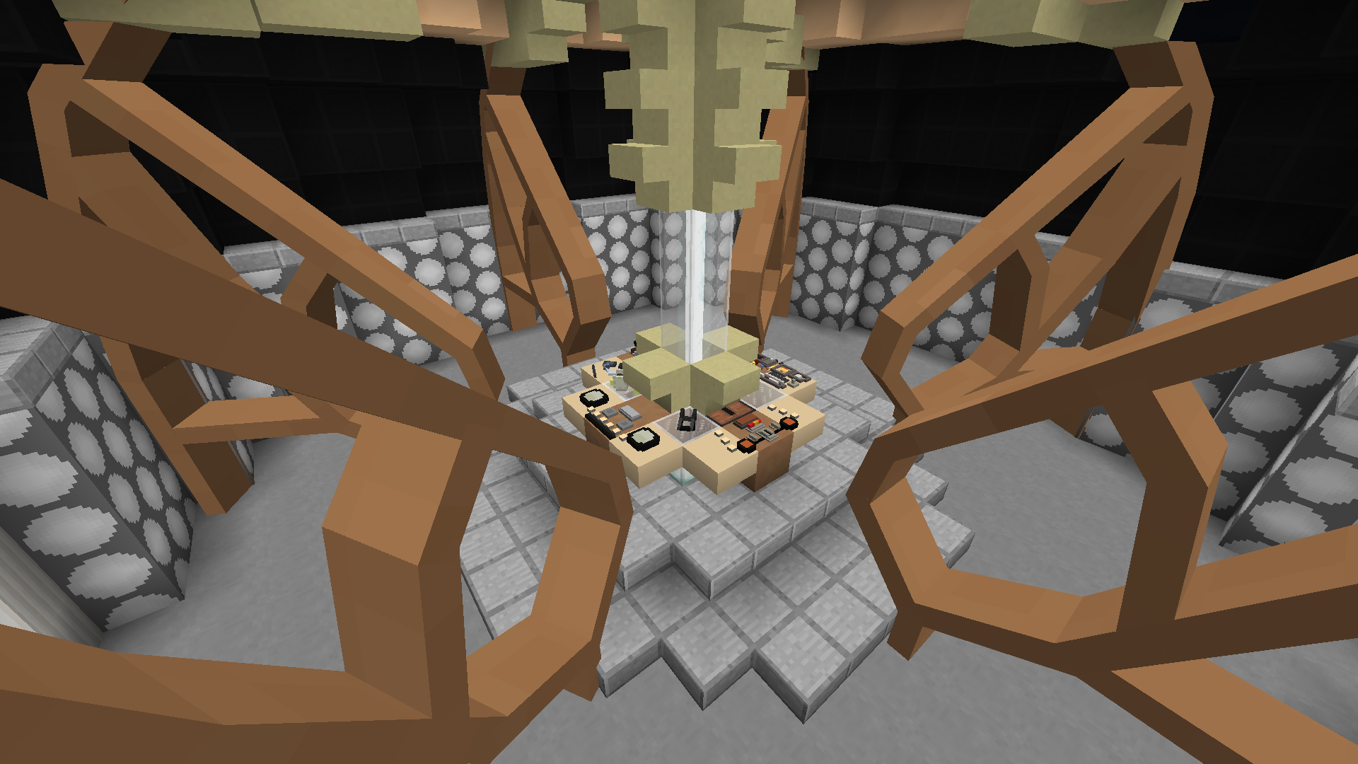
Now, here are all of the features:
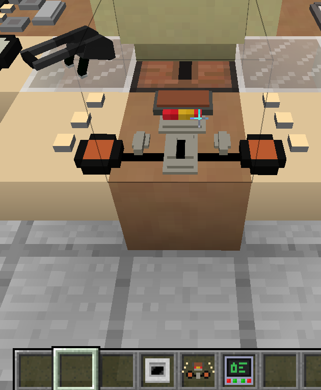
#1 - The right side has these: (Note the jukebox!) (Also note the hotbars tell you what the hidden controls are.)
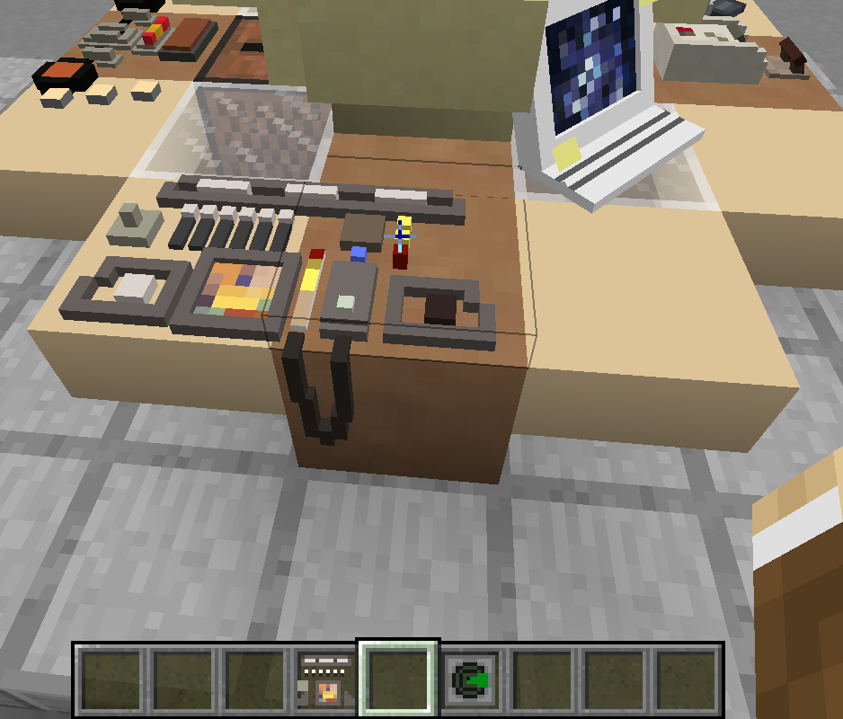
#2 - The back has these:
#3 - The front has these:
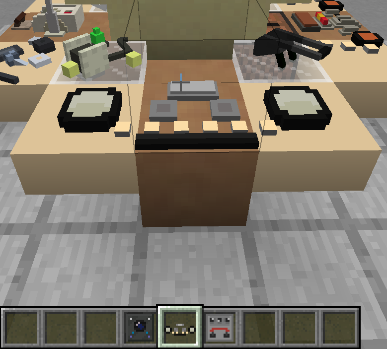
#4 - And lastly, the left looks like this:
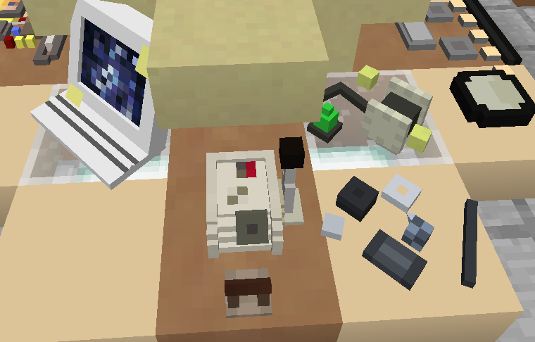
And of course, on the empty glass block corner, you could put any other panel you'd like, say, a Sonic Screwdriver charger?
But the best unmentioned feature is:
#5 - The door works.
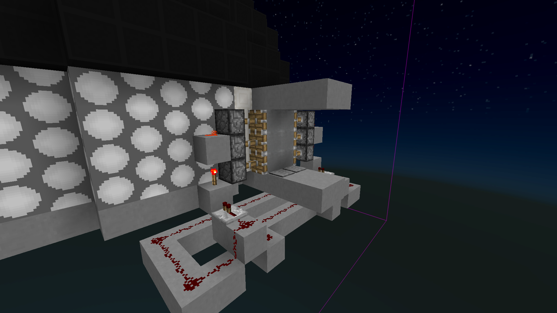
Feeling like the beacon, iron blocks, and jukebox are a bit cheaty? Well, simply remove them!
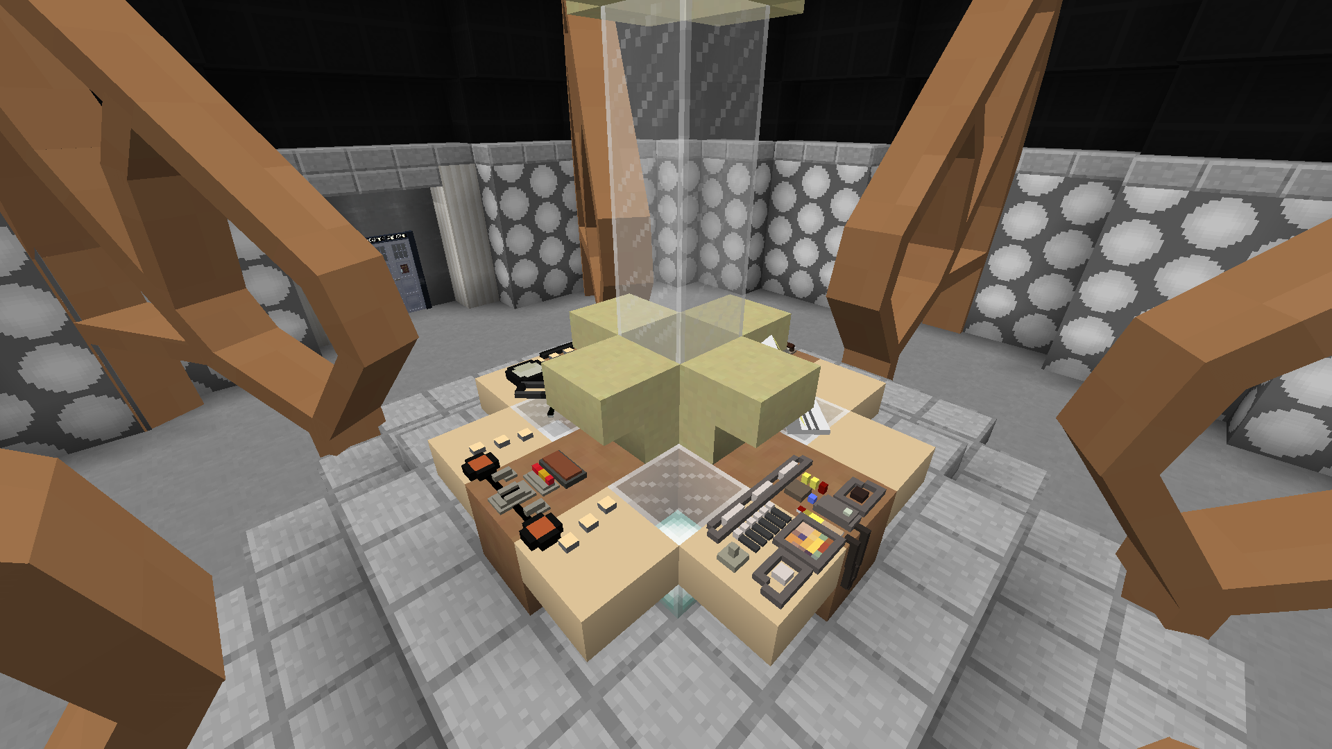
If you really want it to be useless, you can even remove the redstone for the door.
Other changes to note:
The sea lanterns were dropped 1 to put white glass on top.
The sandstone stairs/blocks/slabs were changed to the coral stairs/blocks/slabs.
The interior doors changed from the 2005 Coral interior door to the War interior door.
So yeah, what did you think? Any feedback would be appreciated.
Really Cool!
Thanks!