Hey guys, it's DoctorWhu11
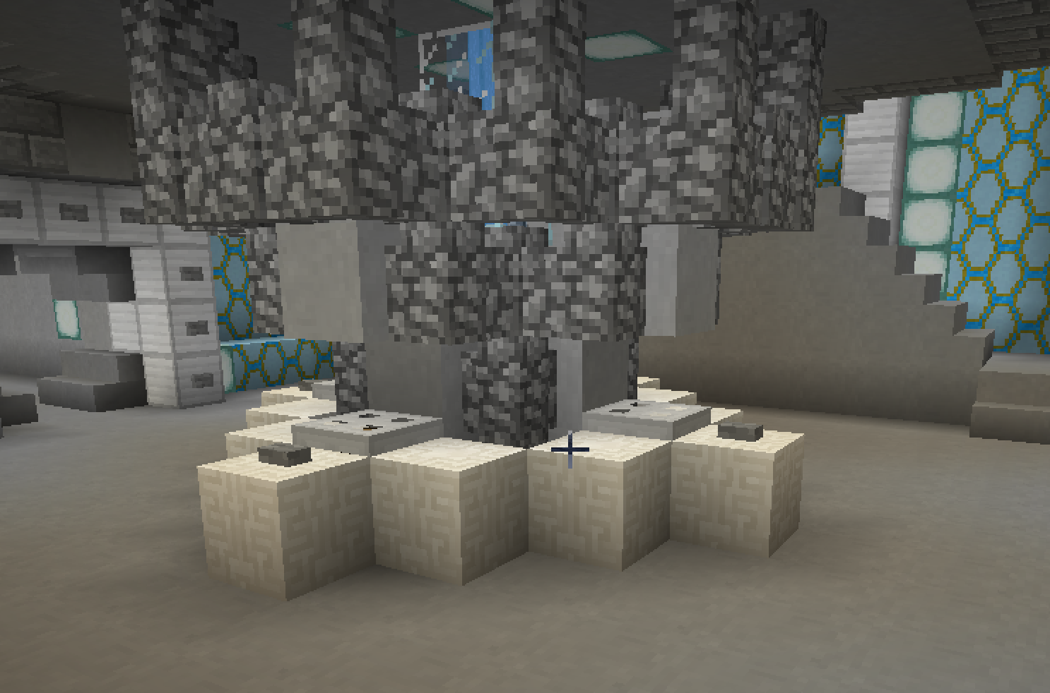
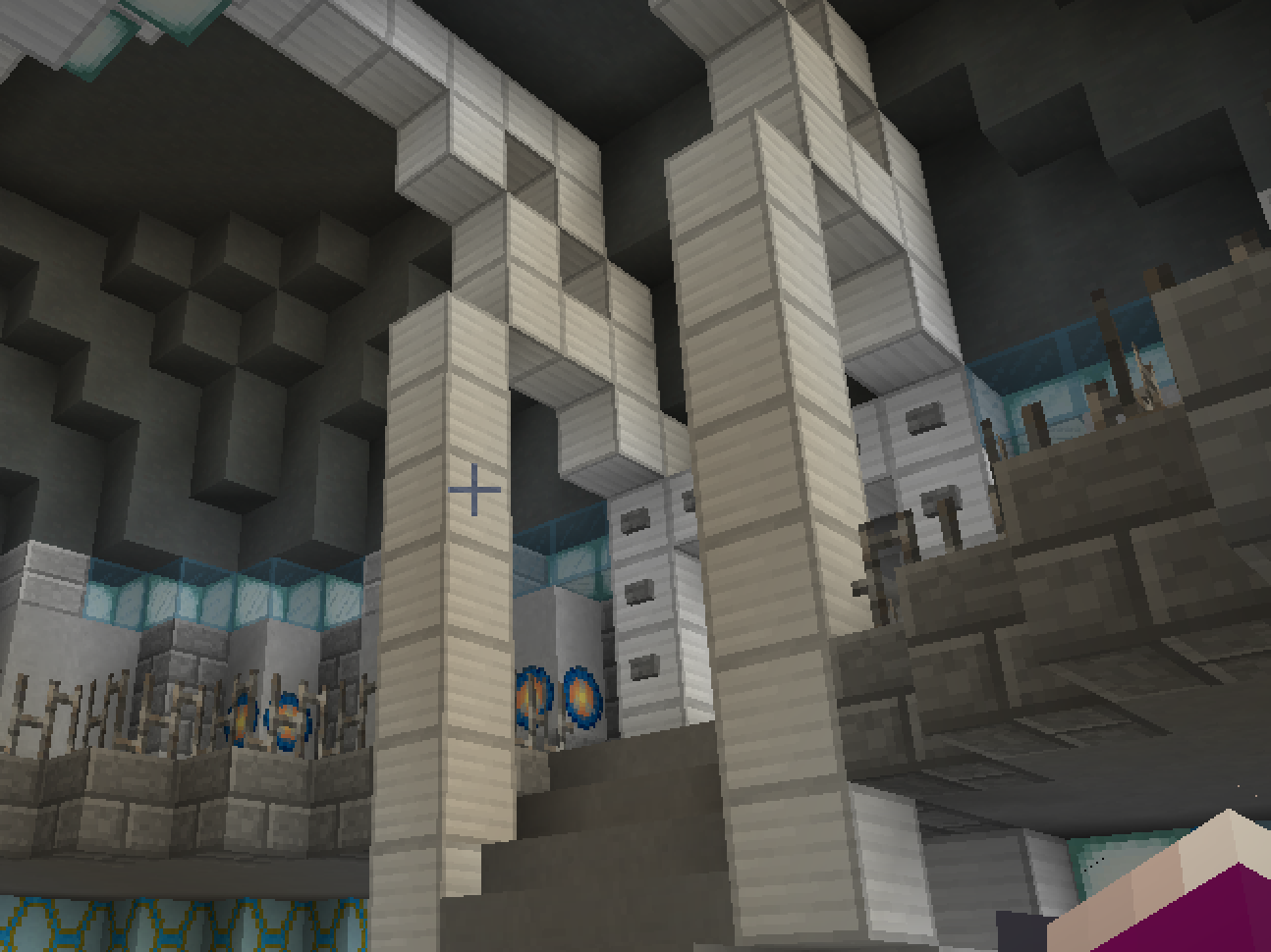
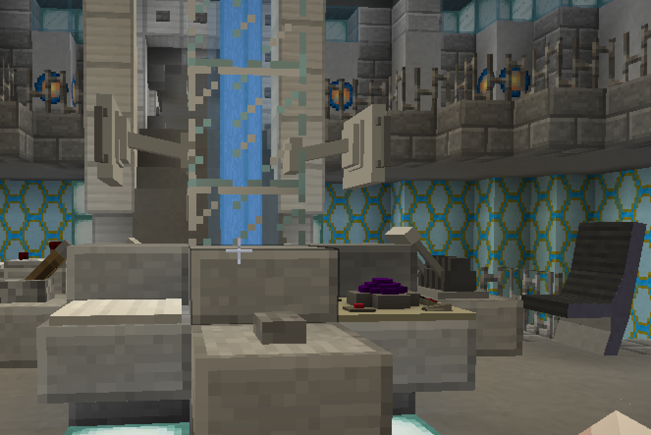
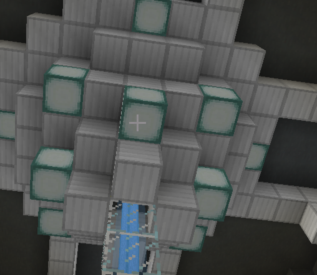
Matt Smith is my favourite Doctor, and his 2013 is my favourite TARDIS Interior. I always love recreating this one. Below are some images:


Don't double post .... the interior is not very good btw...
It's a re-colour of the default one, which looks nothing like the Toyota. The pillars should be blue, not white. The storage areas under the console are made of wood, why are they white? There's also the problem of the corridor entrances being in the wrong places.
Thanks guys. Really encouraged.
I forgot: the chairs aren't in the canon position, they're supposed to be next to the control tables.
Hey !
Since you replied to my thread, I'll do the same to you !
First things first: try not to focus too much on the tone of the comments, and just take the constructive criticism. It may not be easy to do, but in the different comments posted on this thread, there is criticism you can use to improve your building. It's all about making abstraction of feelings to see only the objective, and this last sentence must sound way too deep.
Honestly, I don't dislike your TARDIS. Sure, it's not exactly accurate (I think the colours shouls be changed if you absolutely want it to be the 2013 Console Room), but I rather like it anyway.
Keep up build stuff, and take what's interesting in the comments o/
Thanks. The Runner and I created a whole new 2013, which received much more positive feedback.