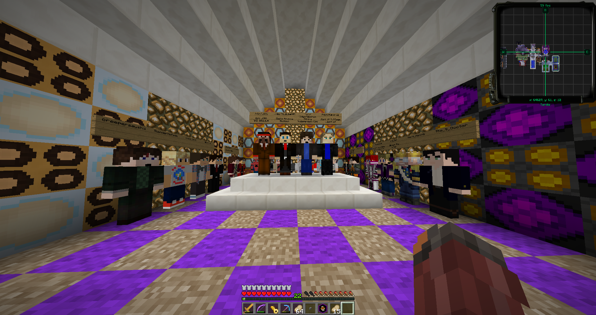
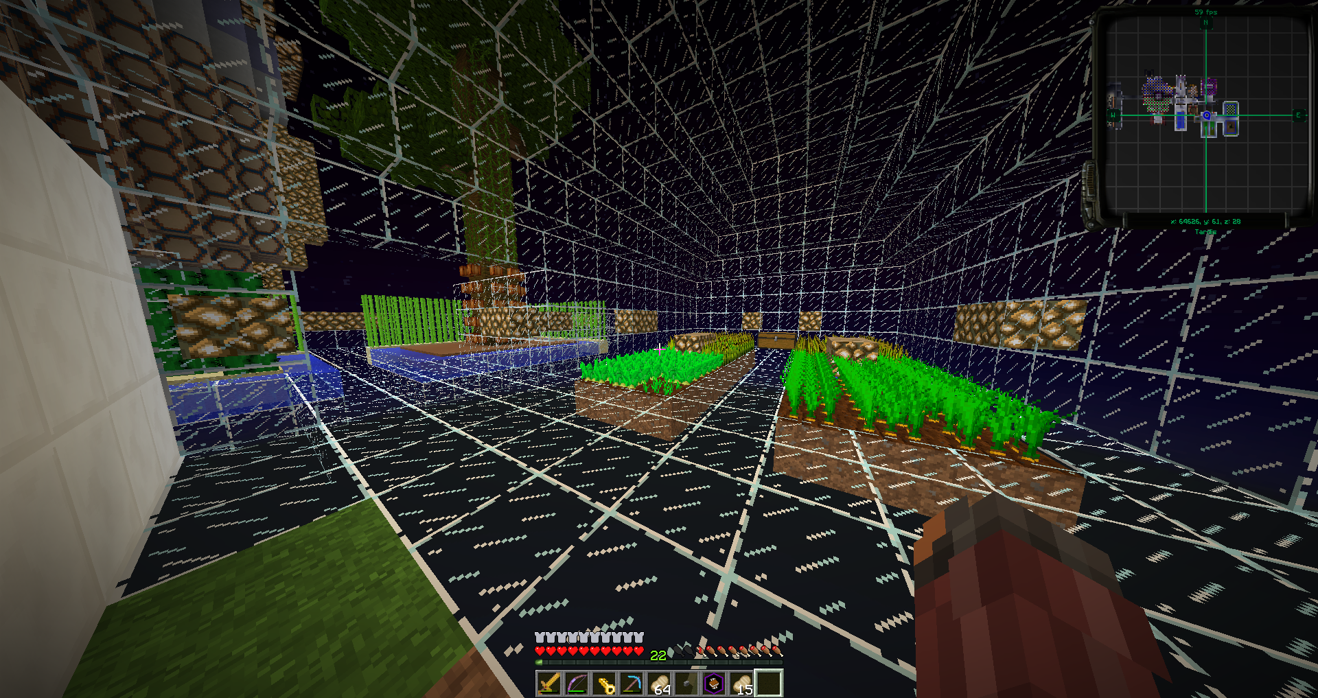
I have a TT Capsule tardis on DMU Public, and I've expanded it a lot. I built all the rooms in survival mode. Here are the rooms:
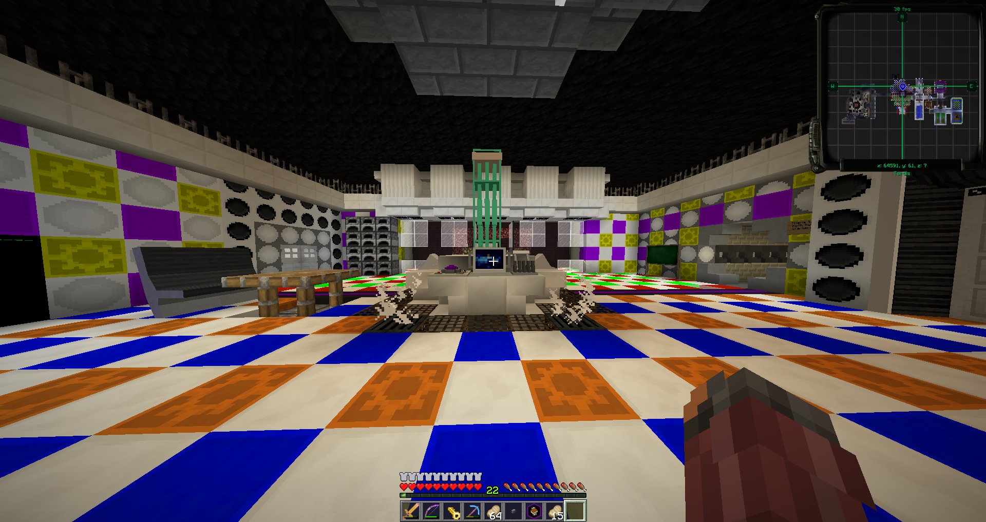
Console room:
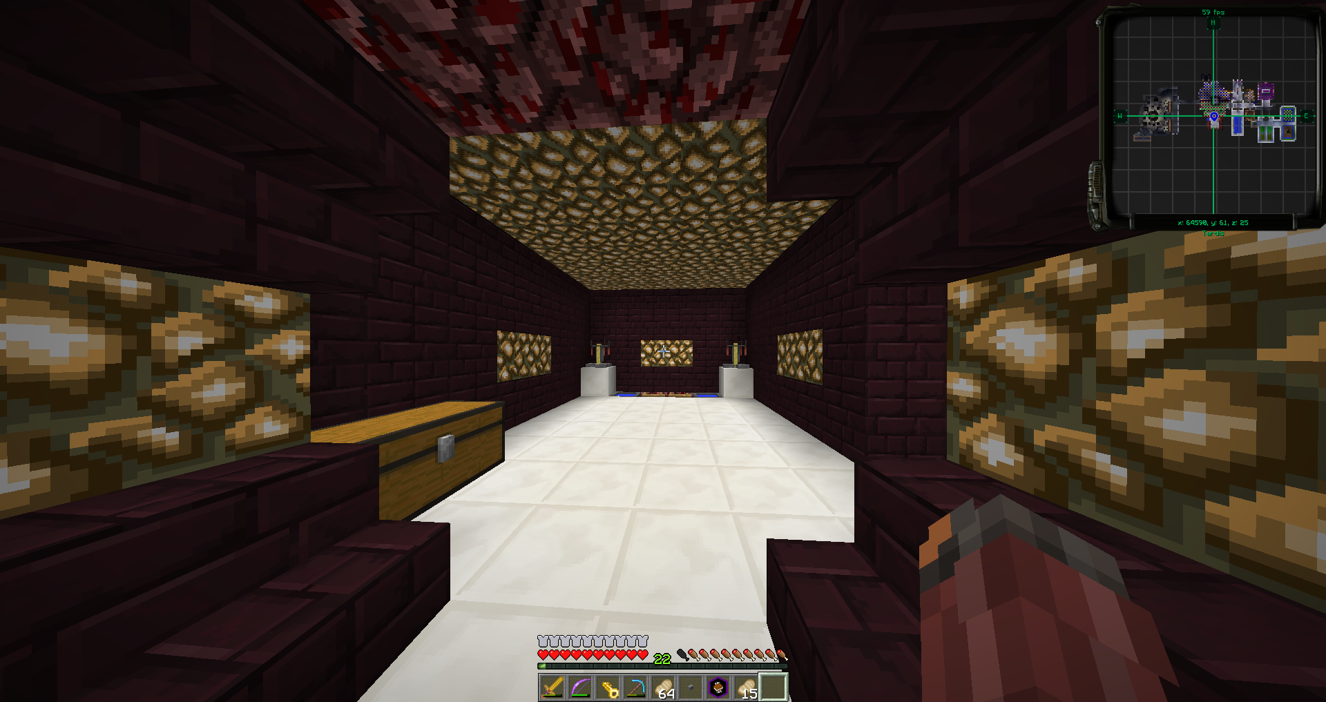
Brewery:
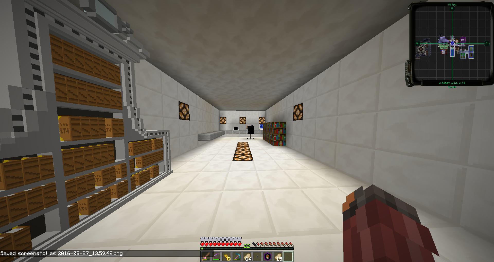
Office:
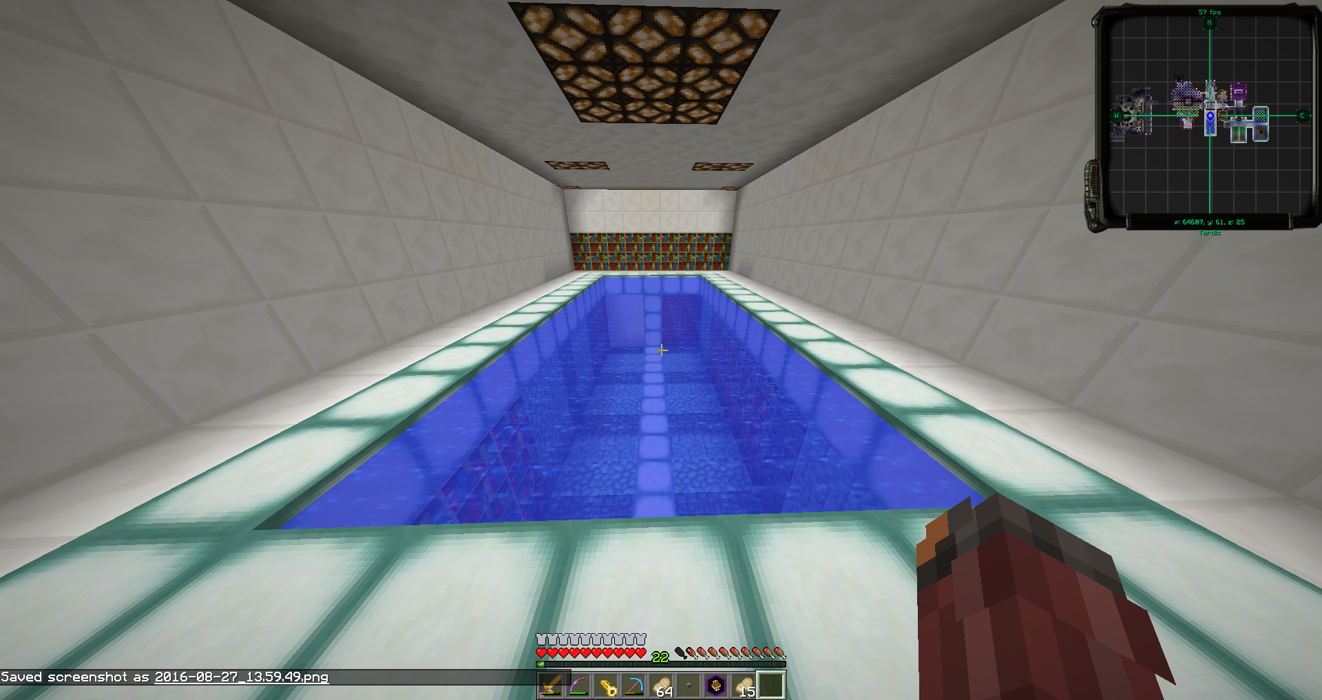
Swimming pool/library:
Staff temple:
Farms:
Secondary console room:
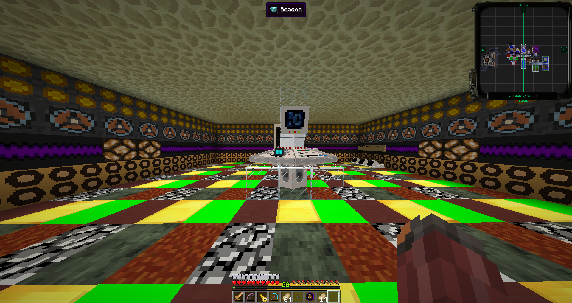
I would love to hear some advice, I'm not really satisfied with my consoles
First off, nice resource pack *wink wink*.
Second, the rooms look great. I really like them.
Oh, you mean the Faithful 32x32 resource pack I installed? Thanks!
jk dhi I love your resource pack
I don't know what I should build next, leave your suggestions here! I'm not really satisfied with my consoles but don't know how to improve them.
Is there any way I can make my controls for the classic console disappear?
And, I would also like to hear feedback about the main console room.Some people say they like it. Some people say the colours clash too much and hurts their eyes a little bit.
No since the console is modeled you can't remove details on it.
No, I mean make the demat lever, monitor and flight panel disappear. Like the fridge console
It's a blockdata thing.
hideModel:1b or something like it
Heads up: pressing F1 on your keyboard will hide the GUI and make photos a lot cleaner.
As for your interiors, your colors are definitely clashing and it hurts my eyes a fair bit, try a more solid color scheme with colors that work together
(For example, dark silver can go well with an electric blue and so forth)
Well, I don't really know what colors 'work well' together.
What colours do green, blue, and yellow go with? I think I'll be keeping those. Or should I have less colours?
I'm doing green and blue for the walls. And orange and red for the floor. Is that a good color combination? Or should I switch the colors a little bit? Let me know
I'm doing green and blue for the walls. And orange and red for the floor. Is that a good color combination? Or should I switch the colors a little bit? Let me know
That sounds terrible honestly
Perhaps consider watching these?
try using complementary colours from the colour wheel, it'll make the colours fit together more
Do you mean use color pairs like, red and green, orange and blue, or yellow and purple? Because that's what I did!
Or do you mean just use purple, orange and green?