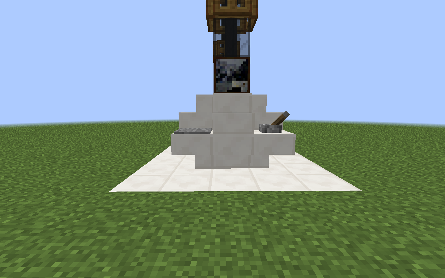
First One:

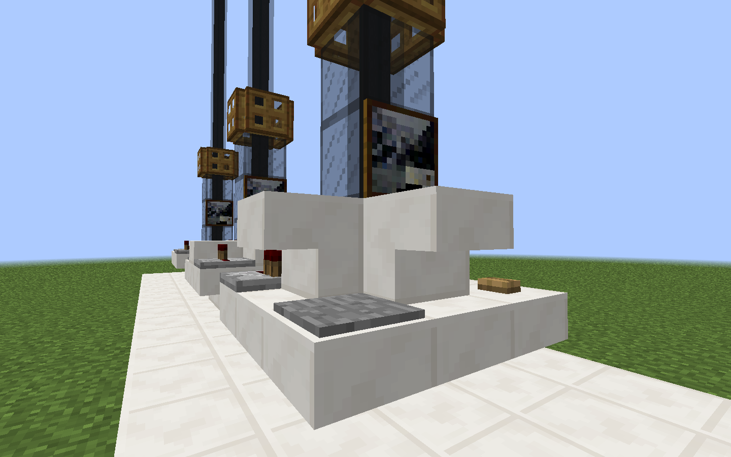
Second One:

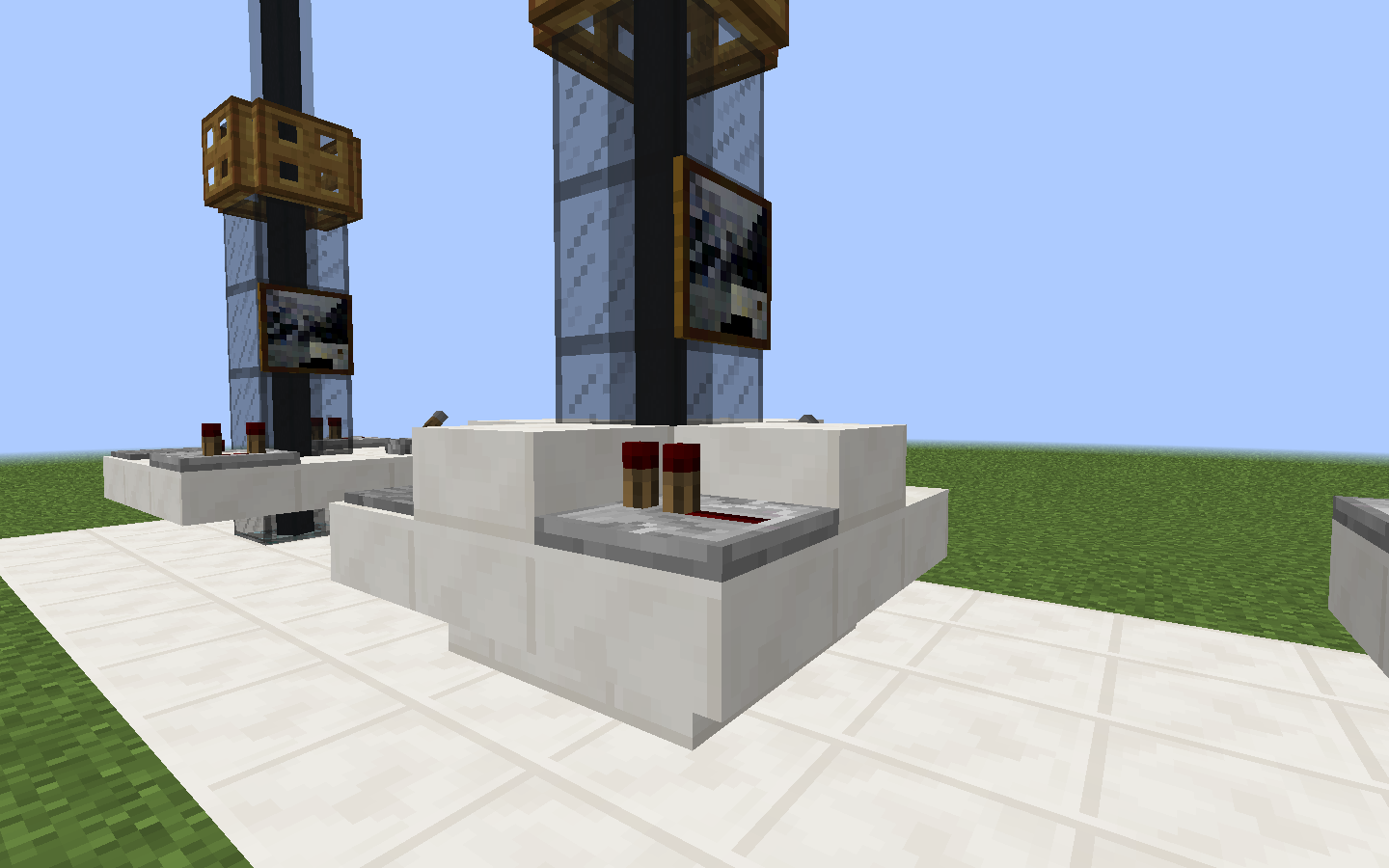
Third One:

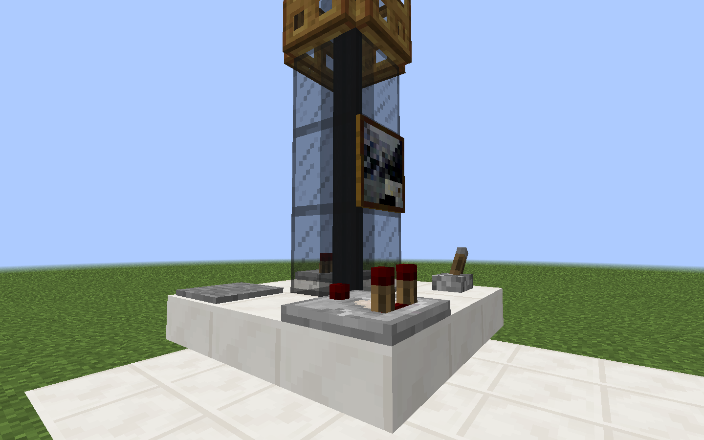
Fourth One:

I made them in Vanilla, and i had some ideas that you've already seen, using pictures (idk if it's called like that, I play in spanish) and trapdoors for it not to look so austere.
All four are exactly the same except with different redstone things on them.
I honestly think this is a waste of forum space.
All four are exactly the same except with different redstone things on them.
I honestly think this is a waste of forum space.
Except for the fact that they are different combinations of slabs and stairs, that's what I mean by styles, sry if it wasn't clear enough.
I don't really like any of them, I didn't like the first one and the rest are the same. You can't change one thing and call it another console. There also very bland and small and I can't see them fitting into a proper tardis.
i think what would work better, is making the console a bit bigger. make it a 5 by 5 and take a block out of every corner, then put your slabs, stairs or whatever else around the space that the time rotor goes