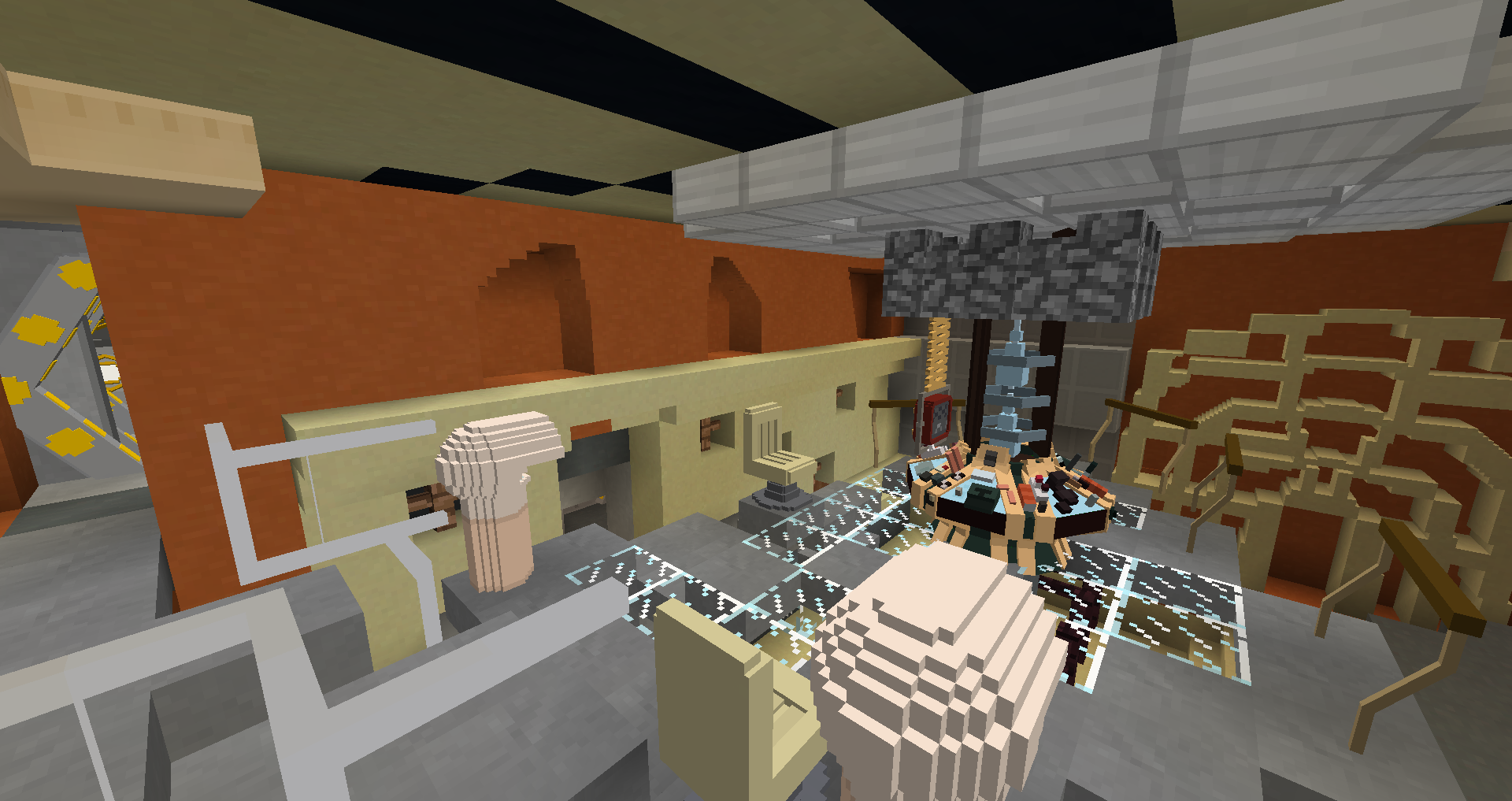
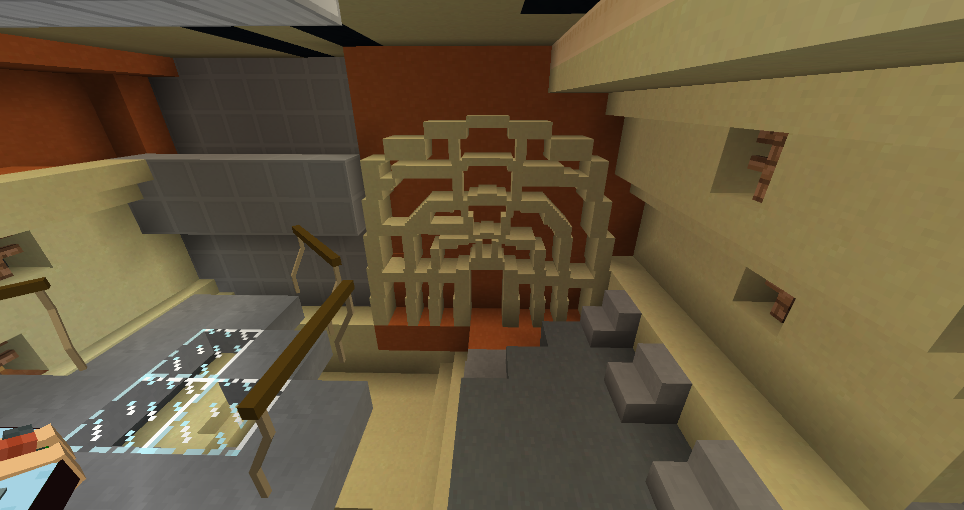
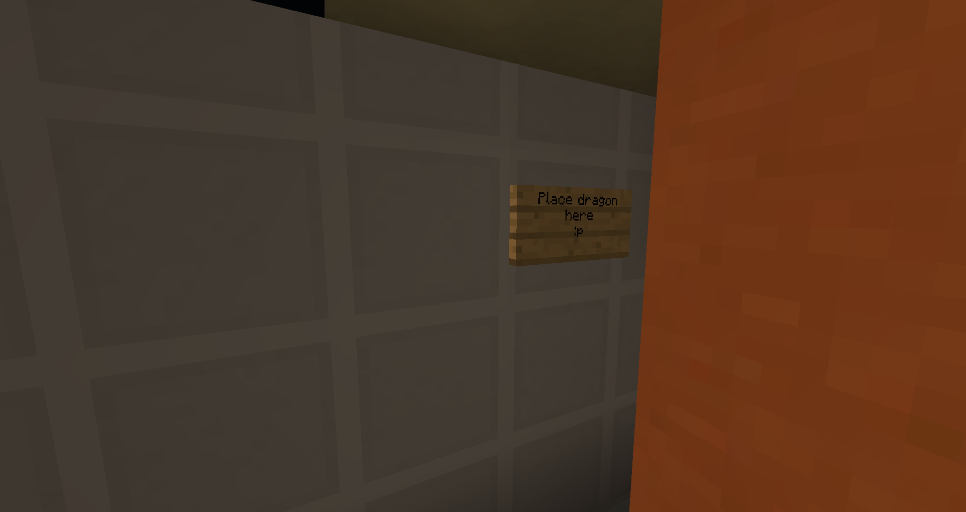
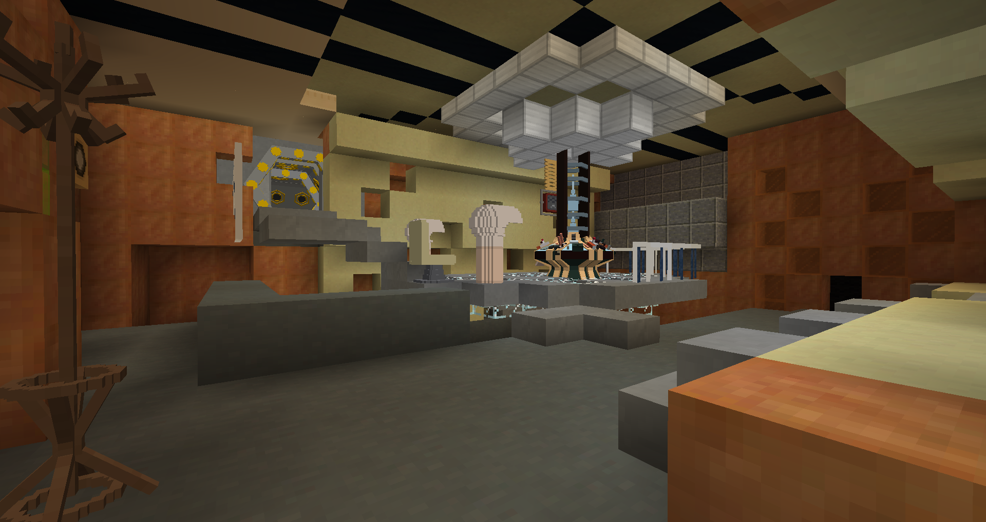
 My try on the Copper interior, since the DM version seems way too big. I used the Garry's Mod TARDIS Rewrite for reference. Whaddya think?
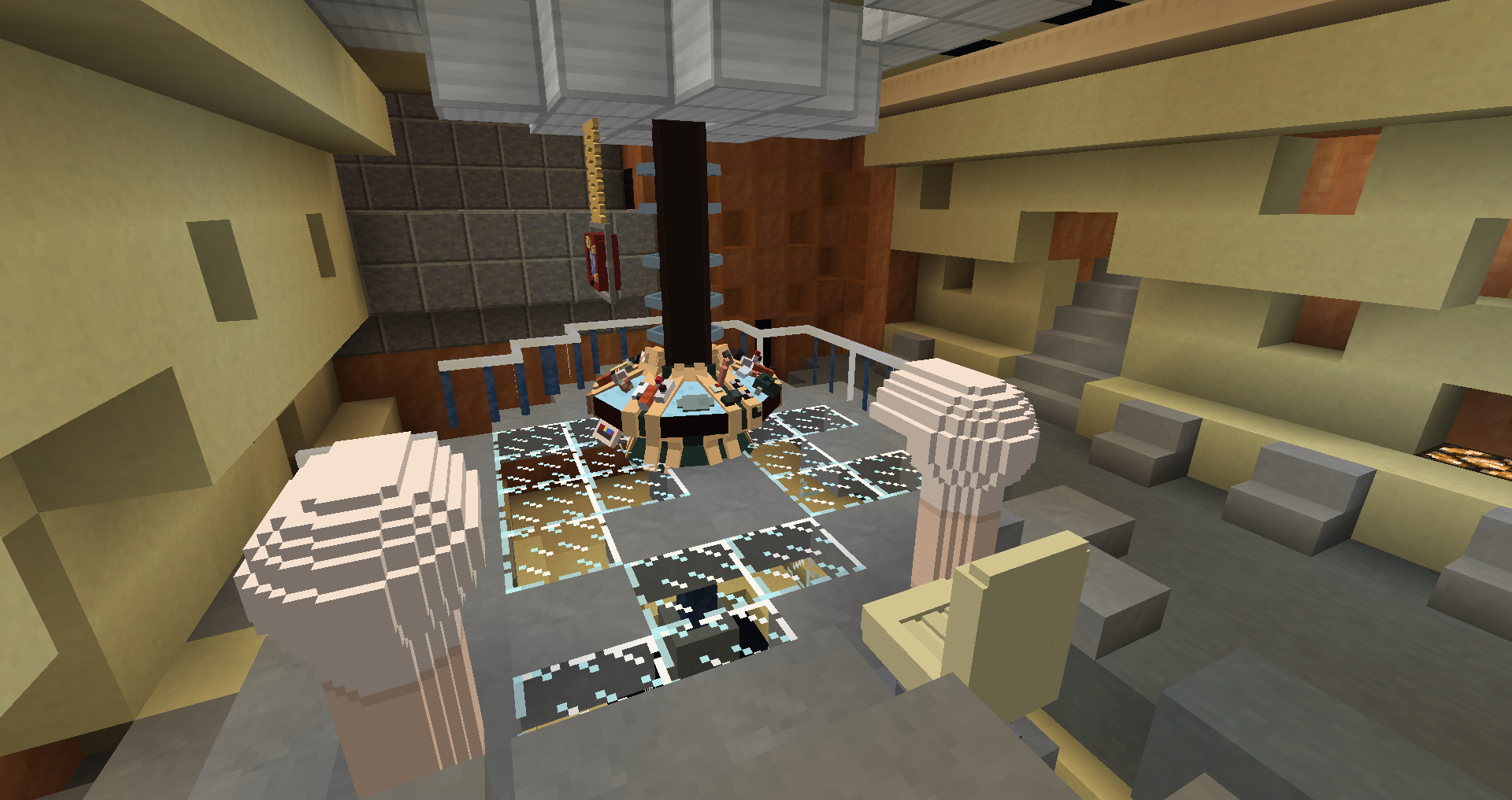
my one complaint is the railings, you used toyota railings which have blue on them, i believe there is a railing just like those that are all gray
I actually wasn't sure which railings to use, since the screen accurate version is dark gray, but I might change that!
Besides the railings Ghost pointed out, it seems way to small.
It'd work much better with a block built console, because it would give the correct scale to the light things.
The chair shouldn't be next to the stairs, the lights should surround it. There should also be two chairs.
Besides the Spider Wall being weird, the only other issue is the coral-y walls.
The one on the door wall is not that good, and the back wall should only go up to the railing height for the balcony, and there should be a stair case into it at the bottom.
Besides that, it's actually not that bad.
since the DM version seems way too big.
The DM version is actually pretty accurate in size... if you actually look at an image of people in the Copper, it's pretty huge.
since the DM version seems way too big.
The DM version is actually pretty accurate in size... if you actually look at an image of people in the Copper, it's pretty huge.
Actually, the current Copper is too large. The one that was being worked on, and is being remade again with the custom modeled controls and such, will be a much more accurate size
Besides the railings Ghost pointed out, it seems way to small.
It'd work much better with a block built console, because it would give the correct scale to the light things.
The chair shouldn't be next to the stairs, the lights should surround it. There should also be two chairs.
Besides the Spider Wall being weird, the only other issue is the coral-y walls.
The one on the door wall is not that good, and the back wall should only go up to the railing height for the balcony, and there should be a stair case into it at the bottom.
Besides that, it's actually not that bad.
About the size- I used the GMod TARDIS Rewrite version, which I am pretty sure is 1:1 scale compared to the player (I used the 11th Doctor player model haha) and it looks about the same scale for the DM version I built. maybe it looks smaller in the picture, idk
The GMod addon for the interior is undersized iirc, and they player model in GMod is similar to the MC Character, as they are both oversized.
Also, even in the addon it's taller than that
After all your helpful comments- improved version!
(probably still kinda small but whatever...)
I made the platform a little higher, changed some of the proportions and added corridors and even the dark 10th doctor's console room from "the doctor's wife".
(I basically cloned it from the SWDTeam version with a few changes I made+ removing almost all light blocks...) I also put a 11th doctor statue for scale.
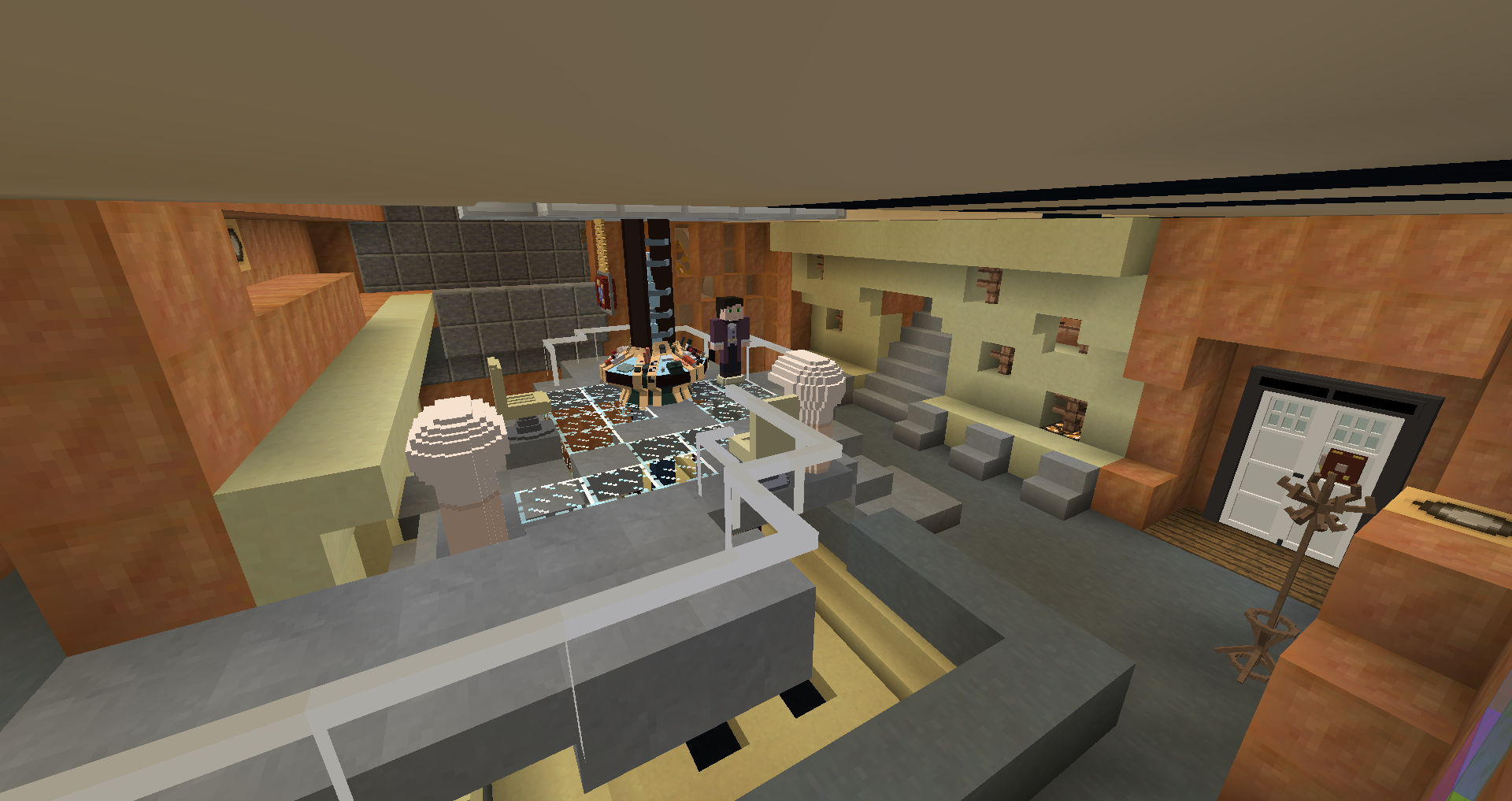
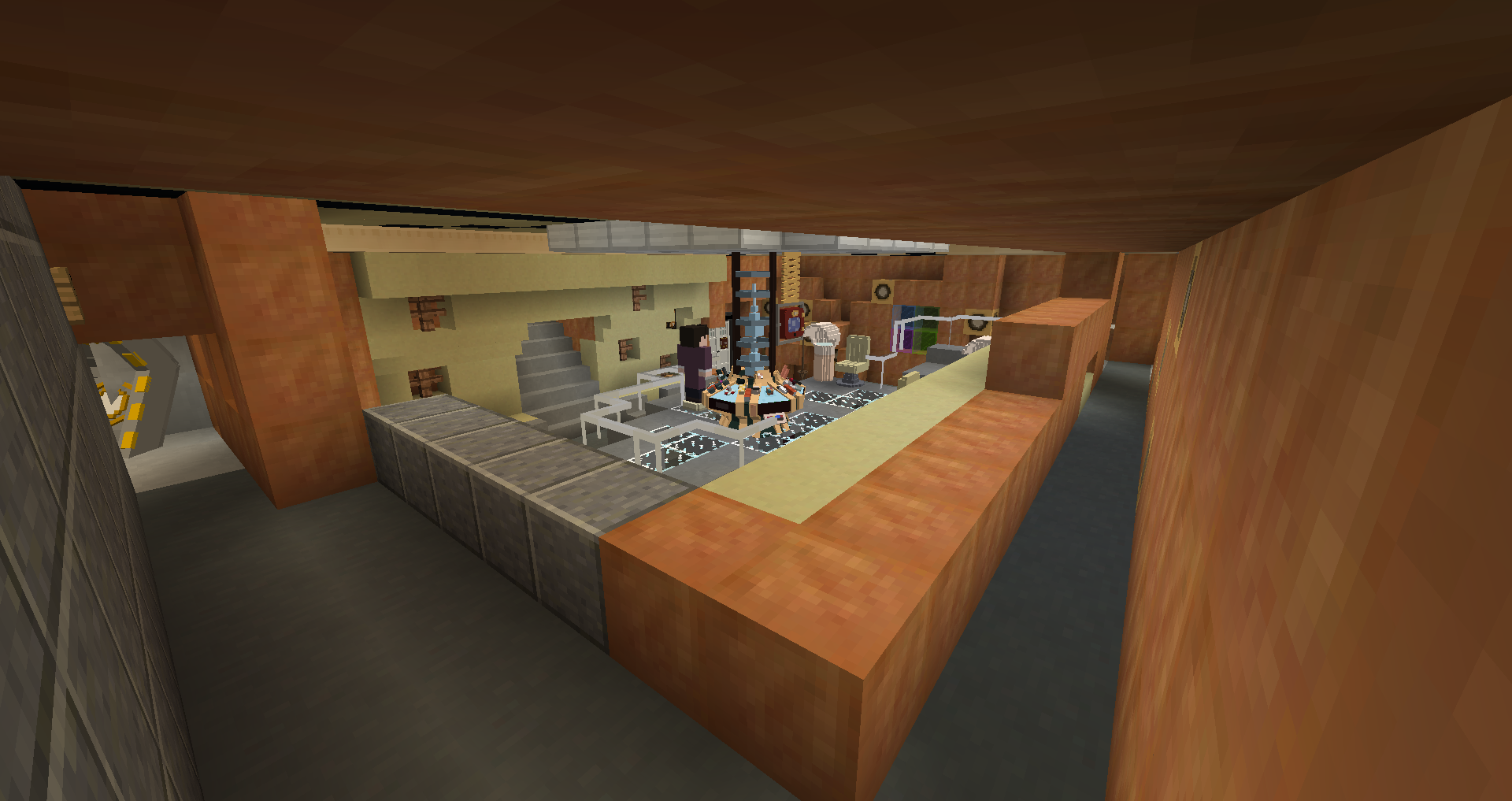
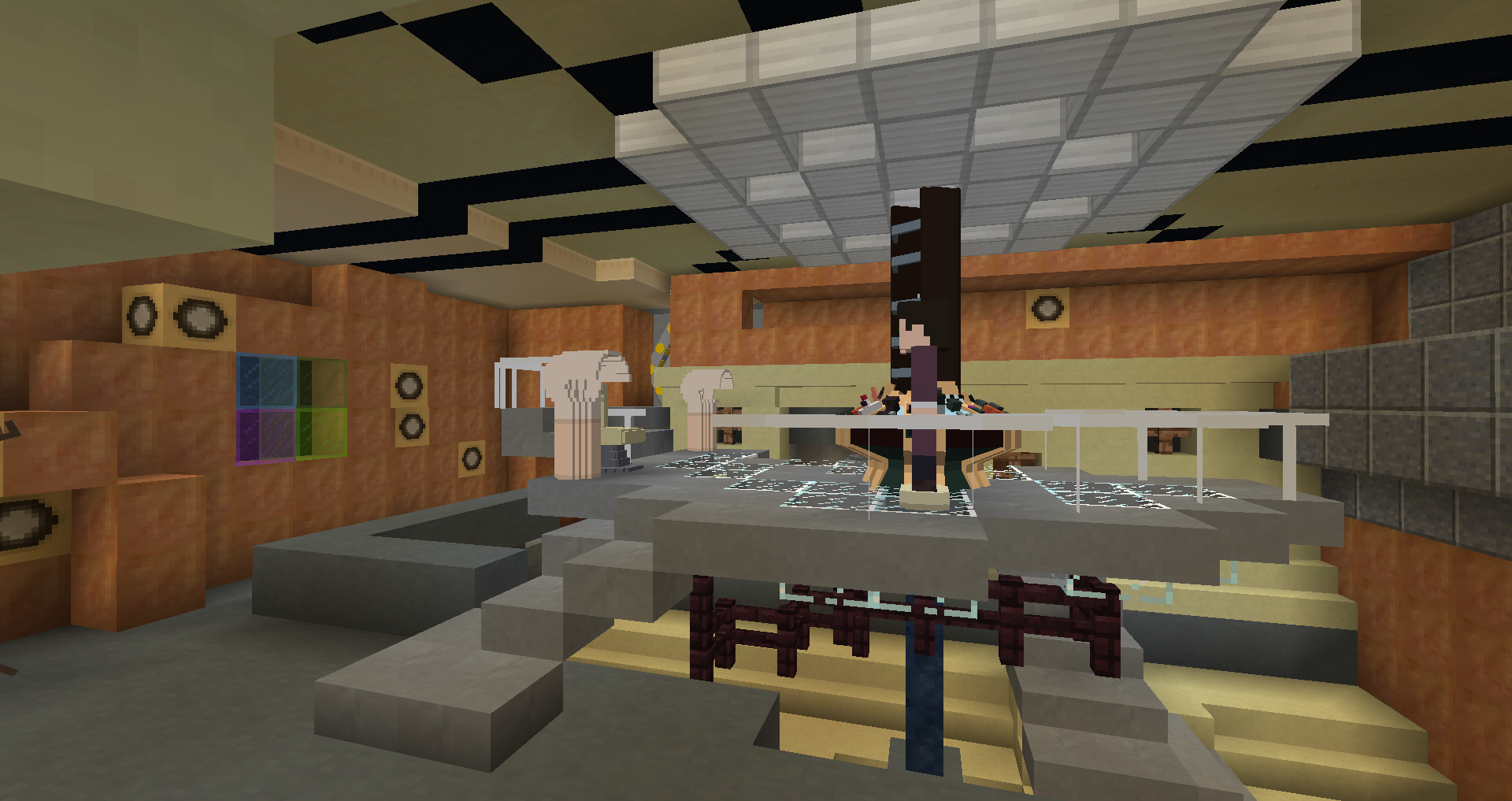
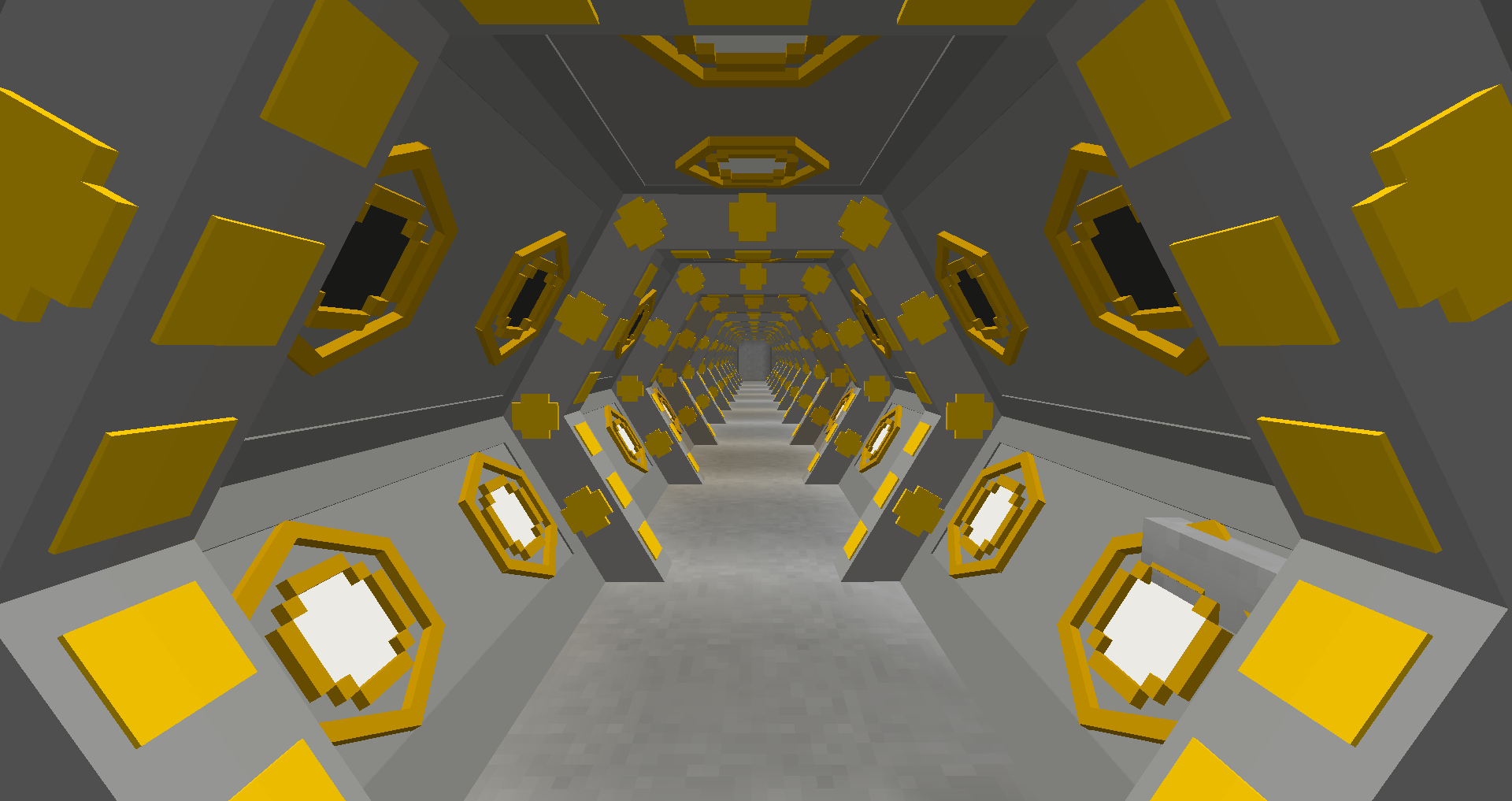
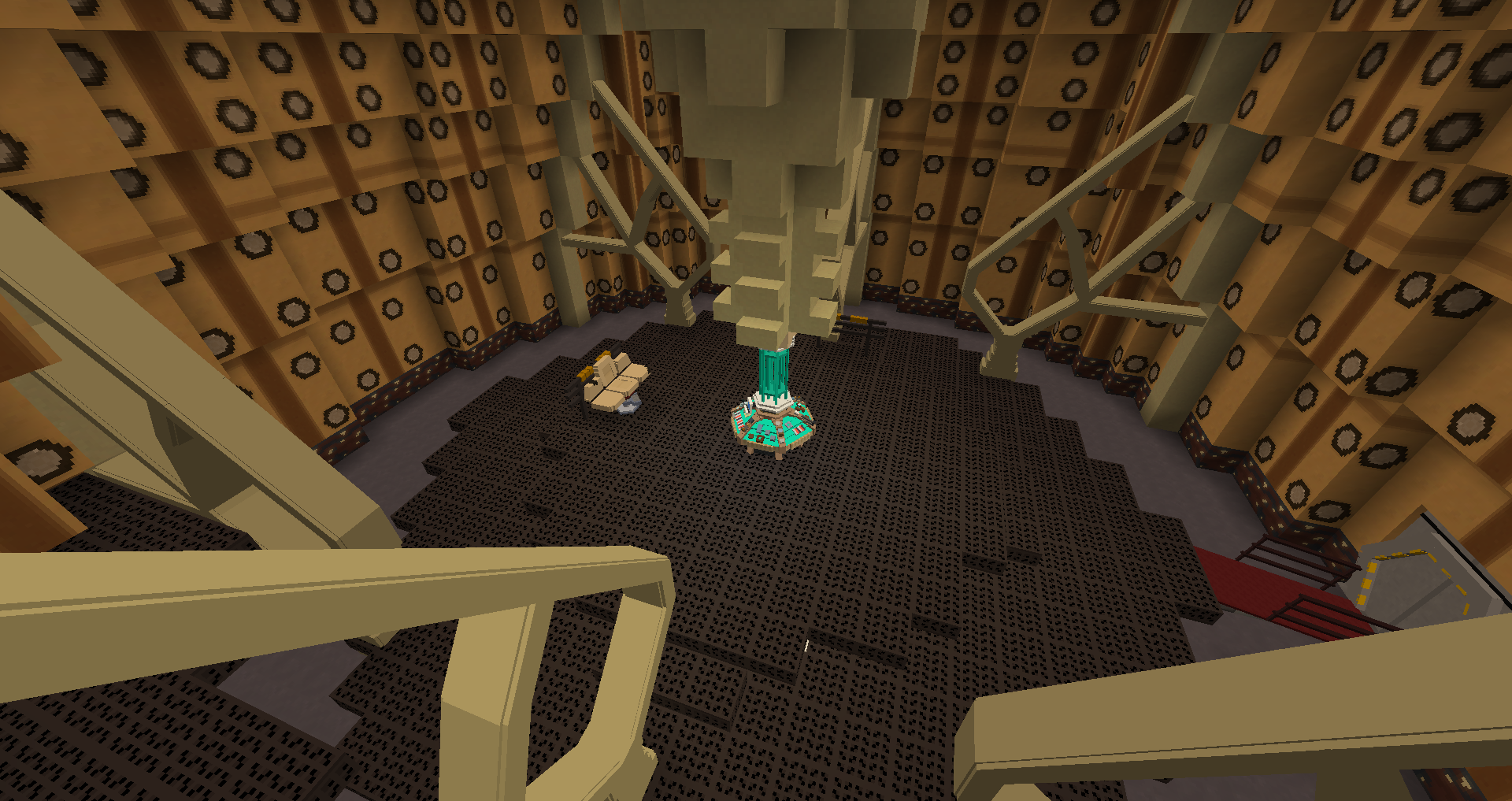
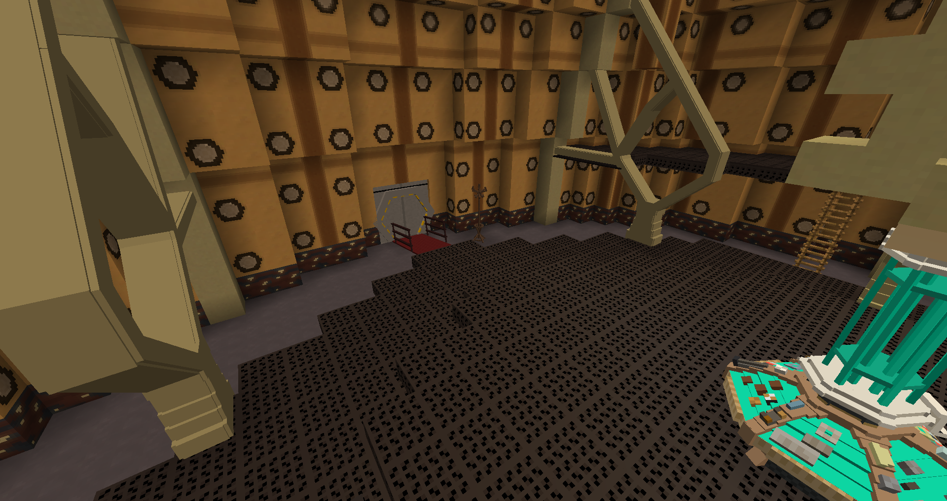
It still looks a fair bit too short, the roundels don't work with that block (which isn't perfect to begin with), scanner looks meh, and still no spider wall. Besides that, it's much better.
Spider Wall Images
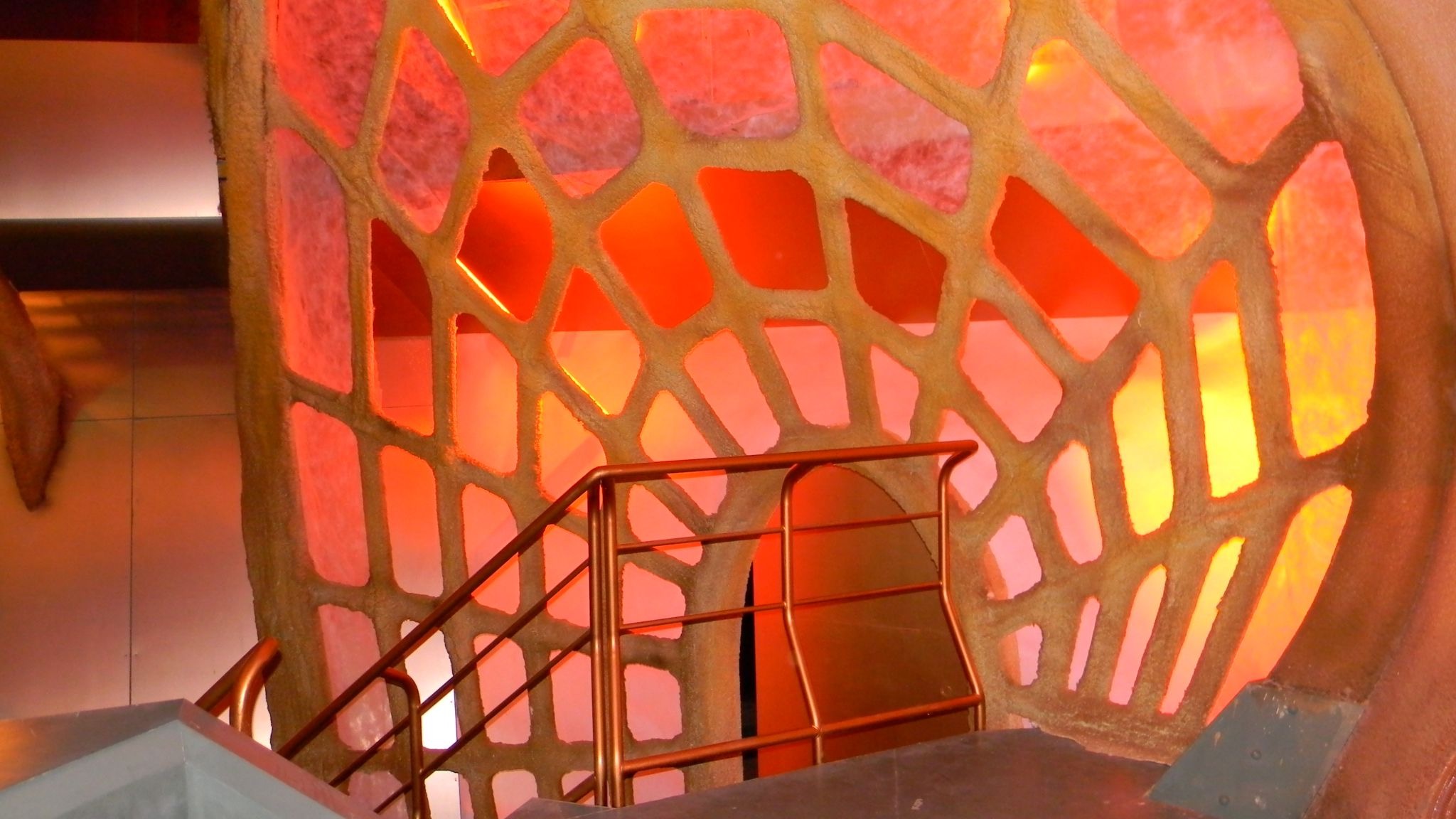
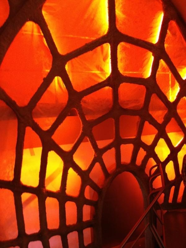
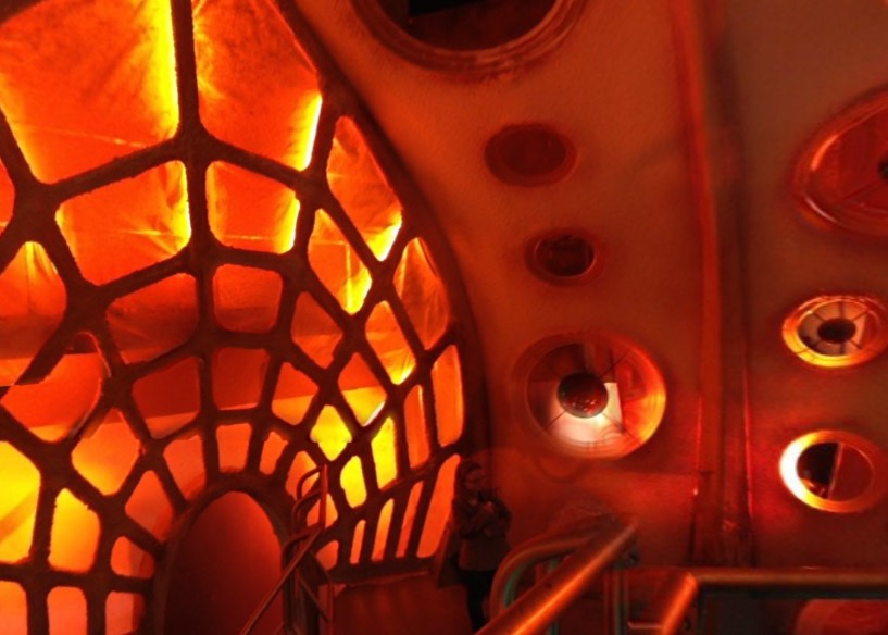
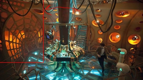
It still looks a fair bit too short, the roundels don't work with that block (which isn't perfect to begin with), scanner looks meh, and still no spider wall. Besides that, it's much better.
Spider Wall Images


I know what the spider wall looks like, but it's very difficult to make it in minecraft, if you have any suggestions it'll be great. I'm also not very happy with the copper blocks, but I couldn't find more suitable replacements. I'll try to see if any other blocks are more fitting
I use the smooth red sandstone slab block (double_stone_slab2 8 I think, not 100%), but orange clay works too (Milk and Ford showed that with the current mod one that looks quite good texture wise).
For the Spider Wall, I'd recommend making 3 arches out of the Coral stone blocks, and then sticking lines between them via slabs and stairs.
Thank you for your suggestion! I actually replaced the dalek city blocks with orange clay, and I also started using chisels&bits for some stuff on this interior. Pics coming soon
I think its perfect
Thank you!
Version 3- Chisels& bits update!
The screen texture might be changed, and it's kinda weird. I'd love to get suggestions on what texture to use.

