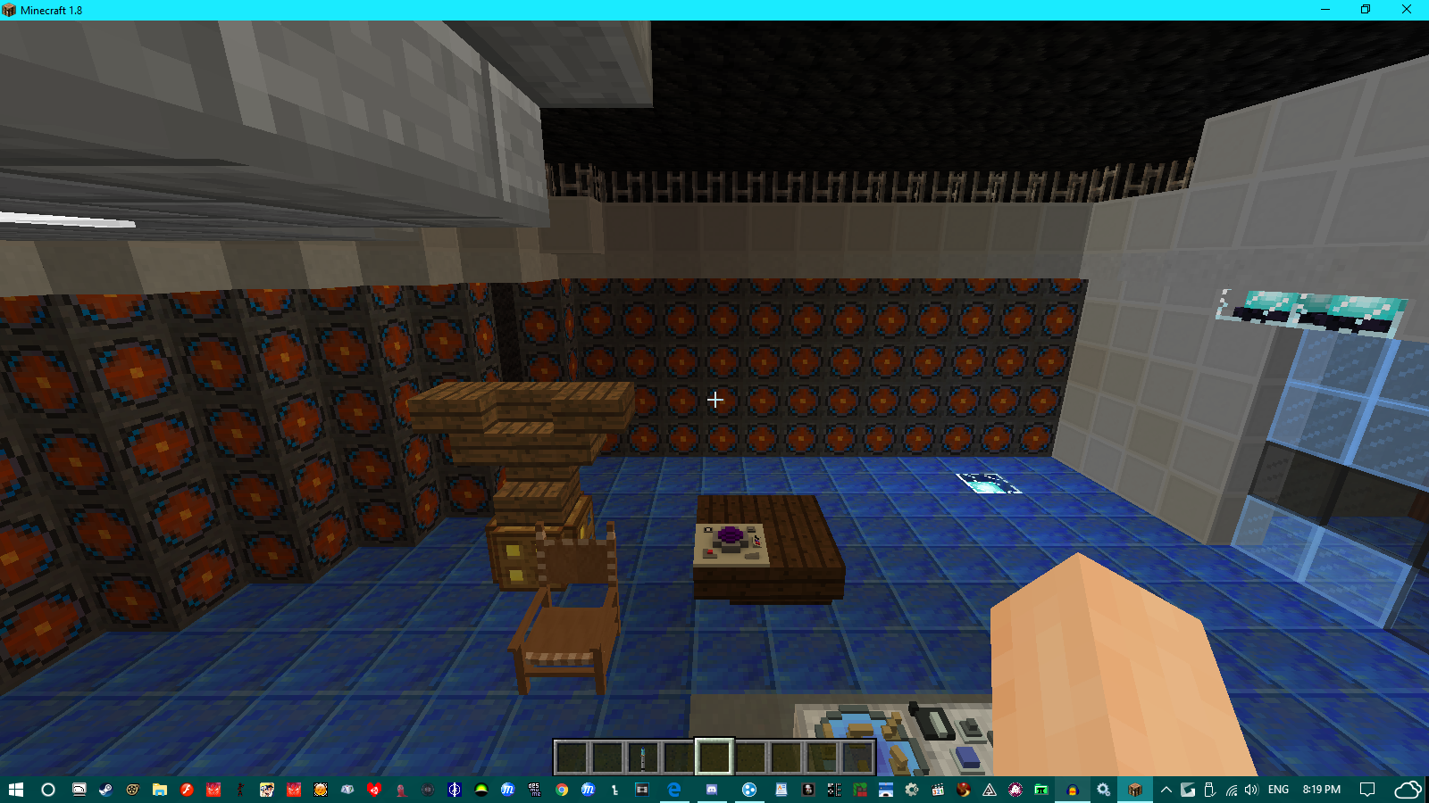
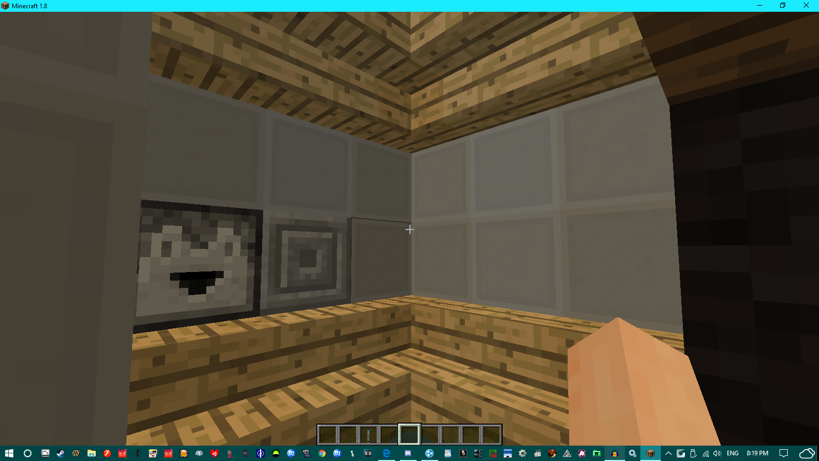
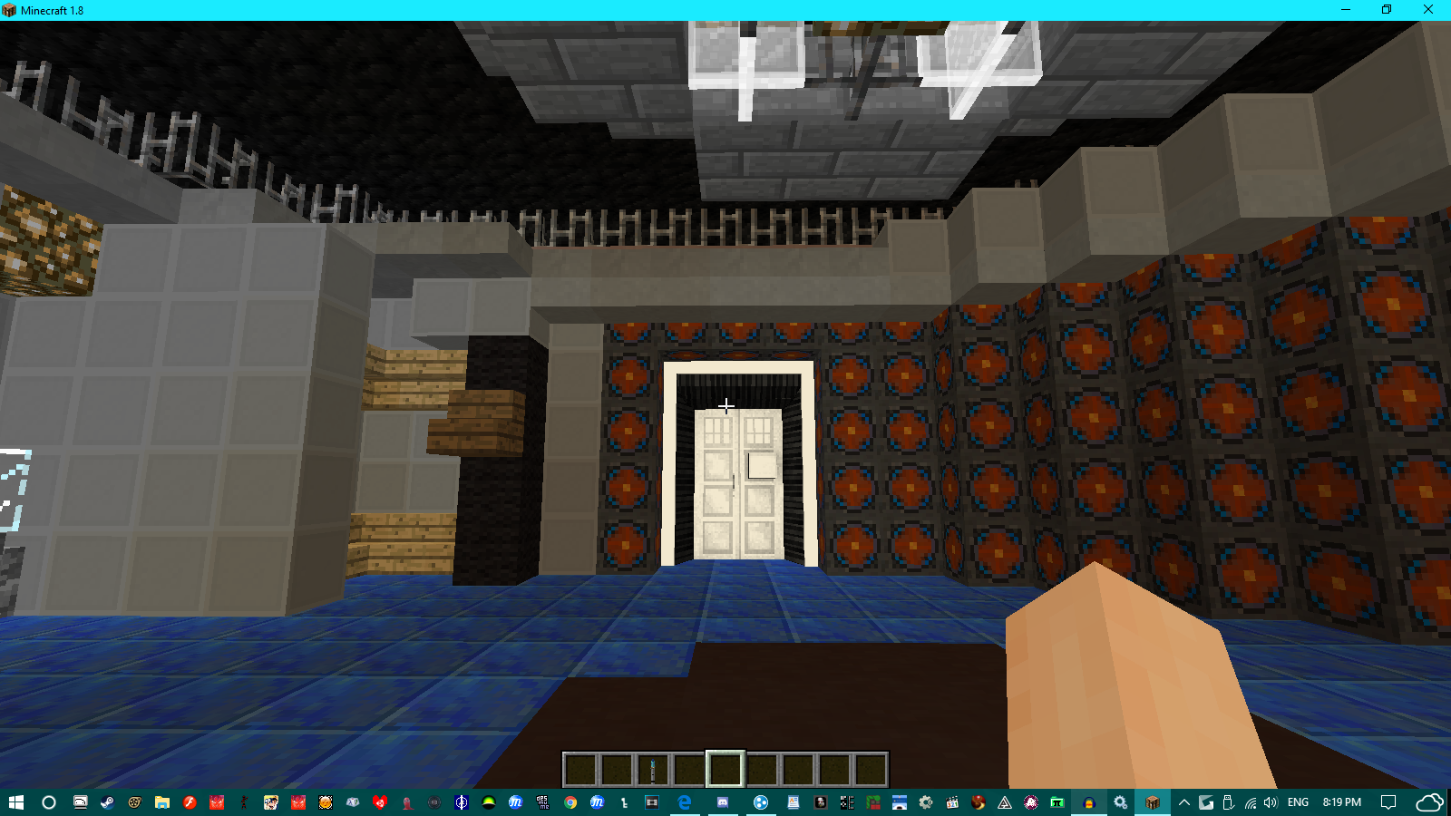
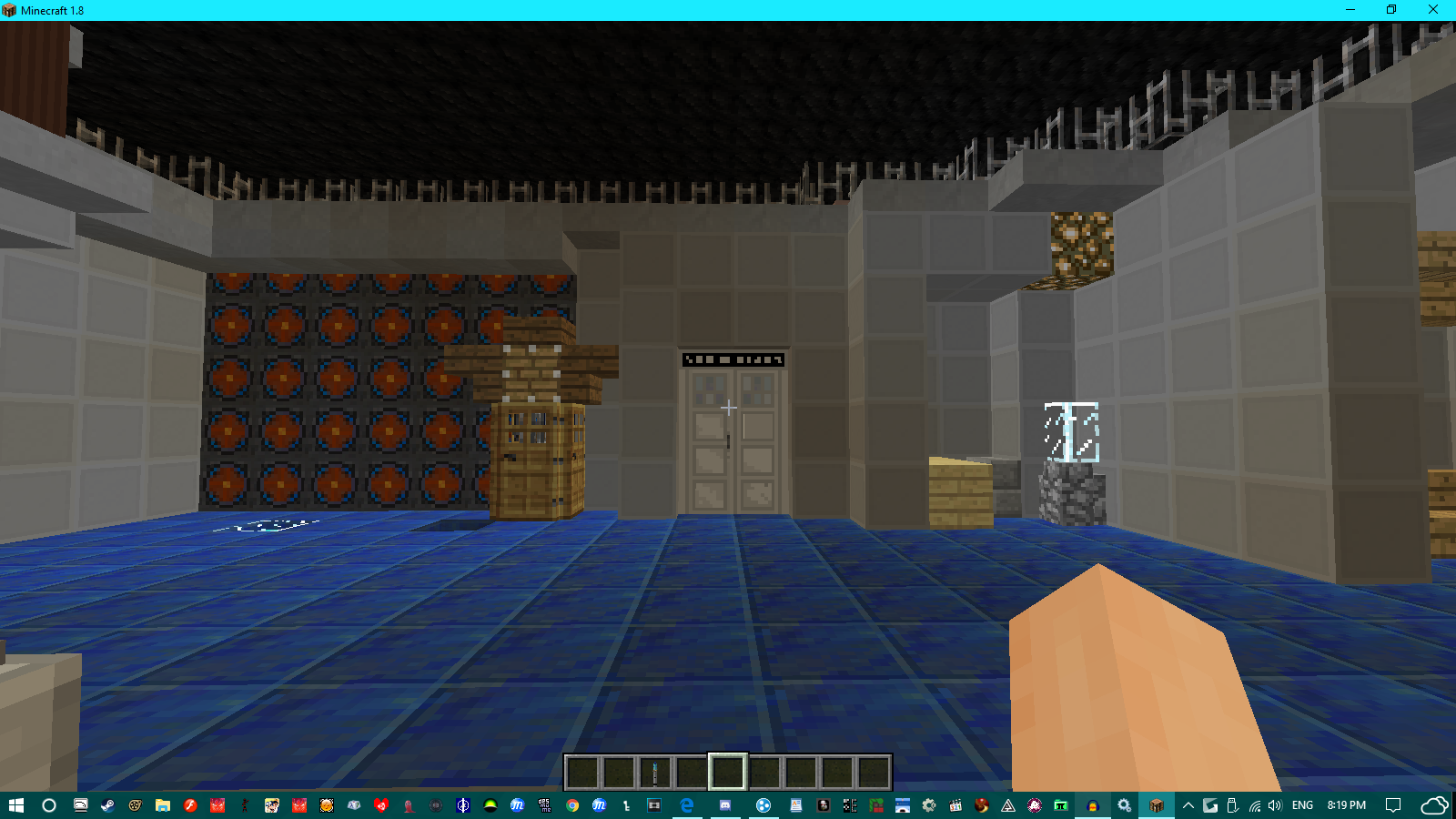
The Main Console:

Flight Panel + Roundy things:

A nice little area for relaxation:

Initial Entrance:

Emergency Exit / Secondary Entrance incase the original entrance is borked:

I got the idea of the Oceanus Console after messing around with the consoles in my world. I based it off of the Dalek Mod Hartnell console, since that was the one I mostly use. And I'm quite happy to see the result being a more modernised Hartnell with oceanic coloring.
I'm not going to lie to you, it's just a remodelled hartnell.
Fantastic! I like the colors! this whoud be a great addition to the mod! hope it gets added!
Oh! Why, thank you!
It's my first (actual(The other one I made was just a Trenzalore-like version of the Vanilla Console)) TARDIS console, I'm actually shocked that people didn't instantly start hating on my TARDIS interior.
i'm sorry but i dont really see how its an 'oceanus' console, unless you mean that as in just a name and not as in water.
when i think 'oceanus' i'd think something like this, but thats just my oppinion
Ghostbuster, thank you for your constructive criticism. I've tried to make it seem like you'd find it on an island(the console being stone and the floor
being like water).
The problem is that I didn't have a big enough slate to work upon and I wanted to stay within the boundaries of the original console room.
If I did have a bigger console room(the smith/vanilla/default/coral), it'd look more oceanic.
My thoughts:
One change I would make, personally, would be to change the blocks below the glass to some other color to give an illusion that the glass has some sort of support and wouldn't just slide out with real physics or something.
I was also going to comment about color clashes, but after reading your comment above, the clash makes a bit more sense to me. If I were building this, I think I'd place a boat in the room somewhere as decor or make a couch with a boat theme in mind to reinforce the oceanic theme.
Those are just suggestions from my opinion though.
I do like the console room otherwise outside of those nitpicks, and I like how you made something so interesting out of something already existing. Even this is just a recolor, it's a recolor done well. Nice job
TL;DR: I'd probably add a more striking clue that it's oceanic and would maybe change the blocks below the glass to something different. All in all, nice job
I like it, except for the roundel-floor combination. Also, not to nitpick or anything, but that's not a custom TARDIS. It's a customized one. But it's a nice concept!
i suggest incorperating white stained glass and water into it somehow but overall good job
Thank you guys for replying, I'm planning to make a custom TARDIS that will take the place of this one, this is just a color scheme concept and not an actual custom tardis(will upload in a different thread, may or may not link to it)