ok, hear me out. Above the Police Box, as always, is the sign that says "Police Public Call Box", right? always has and always will.
Well, I understand that to make it looks Minecrafty, the sign had to be simplified quite a bit. But I think the simplification has led to in-corrections in the sign.
Look at this photo
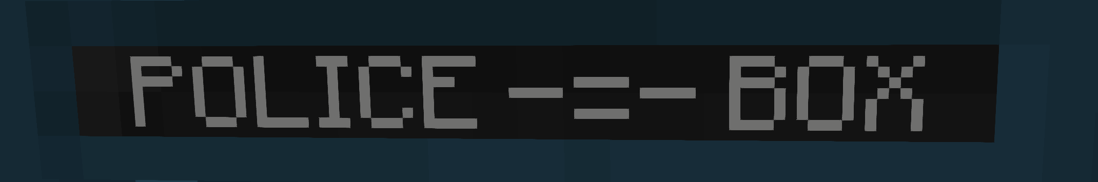
It clearly says "Police --==-- Box". Assuming the "--==--" is supposed to be the simplification of Public Call, shouldn't the sign look like "Police == Box"?
like, right now, if you were to go back to high resolution models, it looks like it would say "Police Police Public Call Box Box"
I do know that the BBC own rights to the TARDIS and in fact, the design of the Police Telephone box as a whole, So is this a deliberate mistake to stay safe from copyright or something??
They most likely done this as when the mod mooves to 1.15 they need the models to be less detail and adding the Public Call would be to detailed and possbily cause lag.
Yea, I get that. the low detail models arn't bad, I actually really like them.
but, like I said, having those three lines between the "Police" and "Box" should only be two lines. one above the other to look like POLICE Public BOX
Call
better visualization:
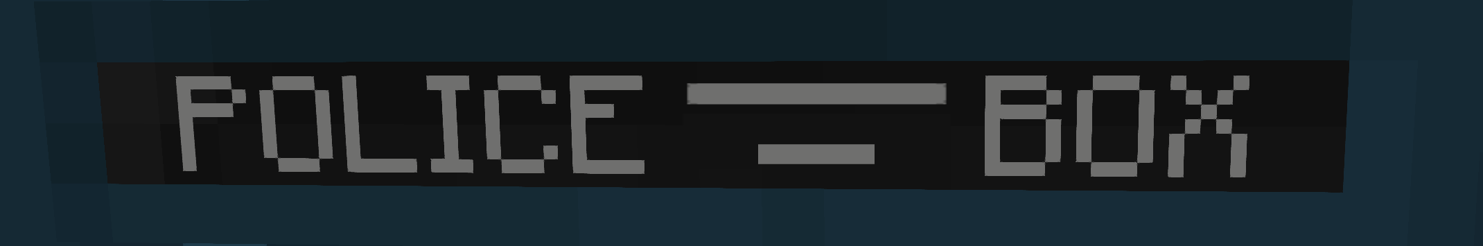
This is what it should look like. or at least, something like this
Contact Us
Email: support@swdteam.com
Mail: SWDTeam, PO Box 1202, Whitstable, CT1 9RL